

iTEA Singapore
A product-led digital redesign for iTEA Singapore, combining layered drink compositions, campaign storytelling, flavour discovery and a responsive catalogue in one warm, editorial experience.
- Role
- Design + build
- Services
- Art direction · UI/UX design · Creative frontend · Motion design · Responsive design
- Year
- 2026
- Status
- Concept build
Overview
The brief
iTEA's menu is large and visually varied - fruit teas, milk teas, oolong, matcha, ice-blended - and a single splashy hero could not carry all of it. The site had to feel lively without turning chaotic: every drink needed a recognisable identity, and product browsing, seasonal campaigns and brand storytelling all had to coexist and stay clear on a phone.
An independent, unofficial concept. Business facts were researched from public sources; all photography is licensed placeholder imagery. Not the official site.
Approach
How I built it
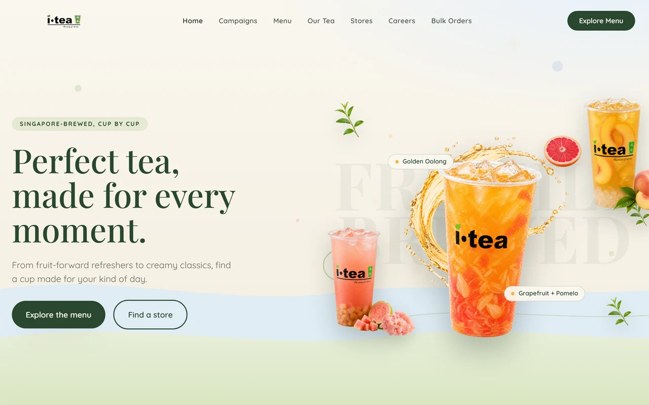
Opened on a layered multi-product hero - a Grapefruit + Pomelo centrepiece with Peach and Pink Guava supporting cups, restrained fruit and botanical accents and pale wave layers - so the range reads at a glance without clutter.
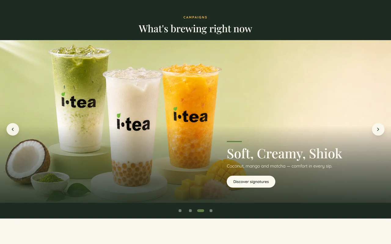
Built a campaign carousel for rotating seasonal stories, with arrow, dot, keyboard and swipe controls and autoplay that pauses on hover, focus and reduced-motion.
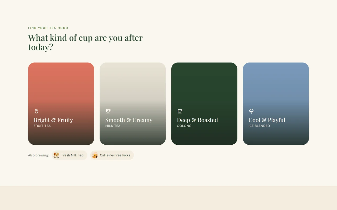
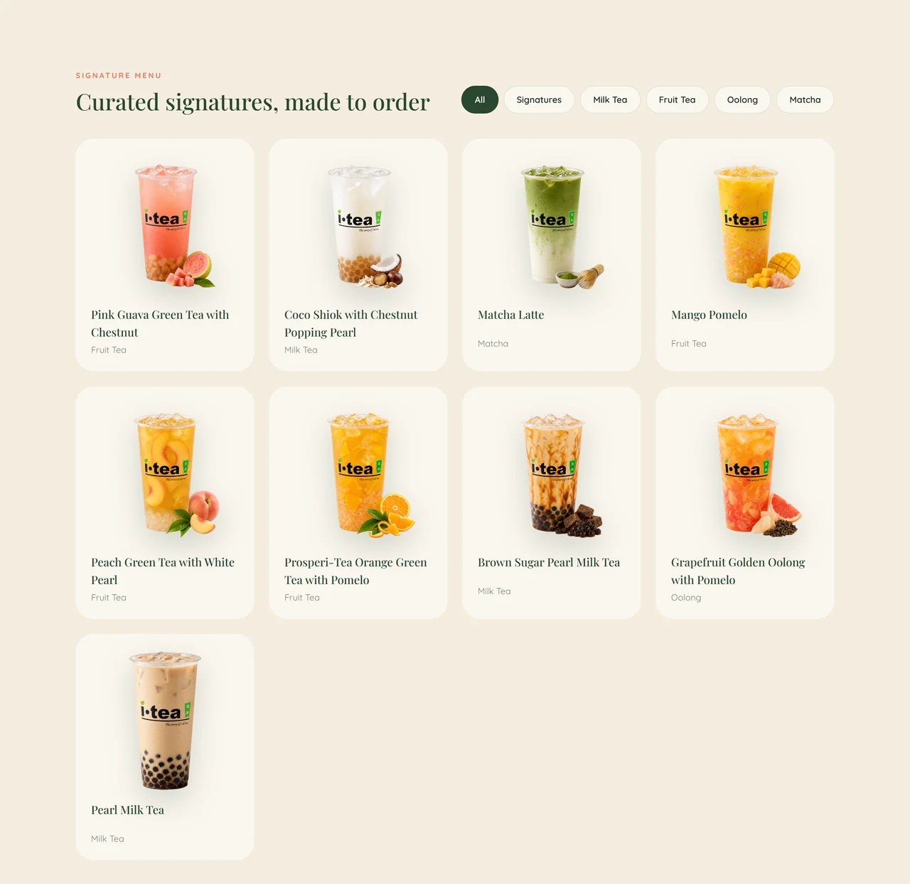
Added a mood-led discovery row and a filterable signature catalogue, so visitors can browse by taste or by category, with the menu driven from a single data array.
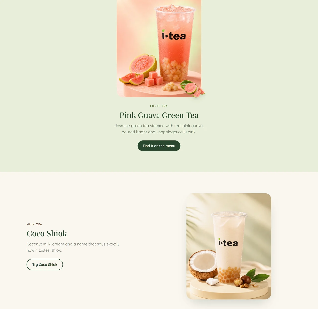
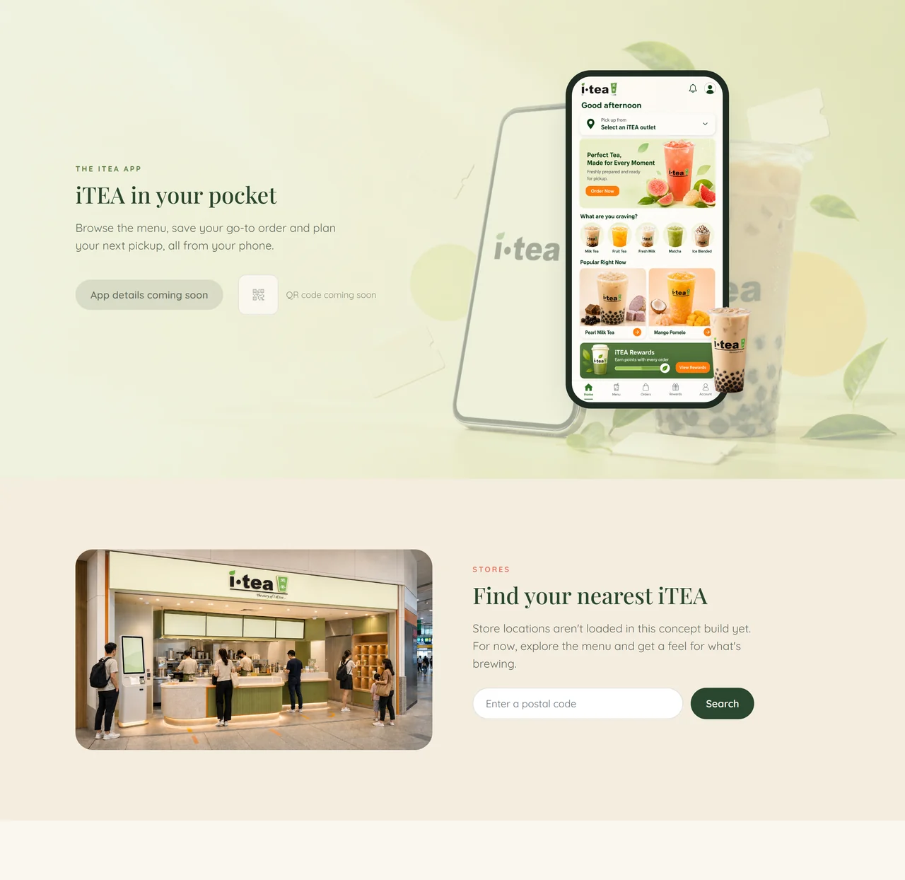
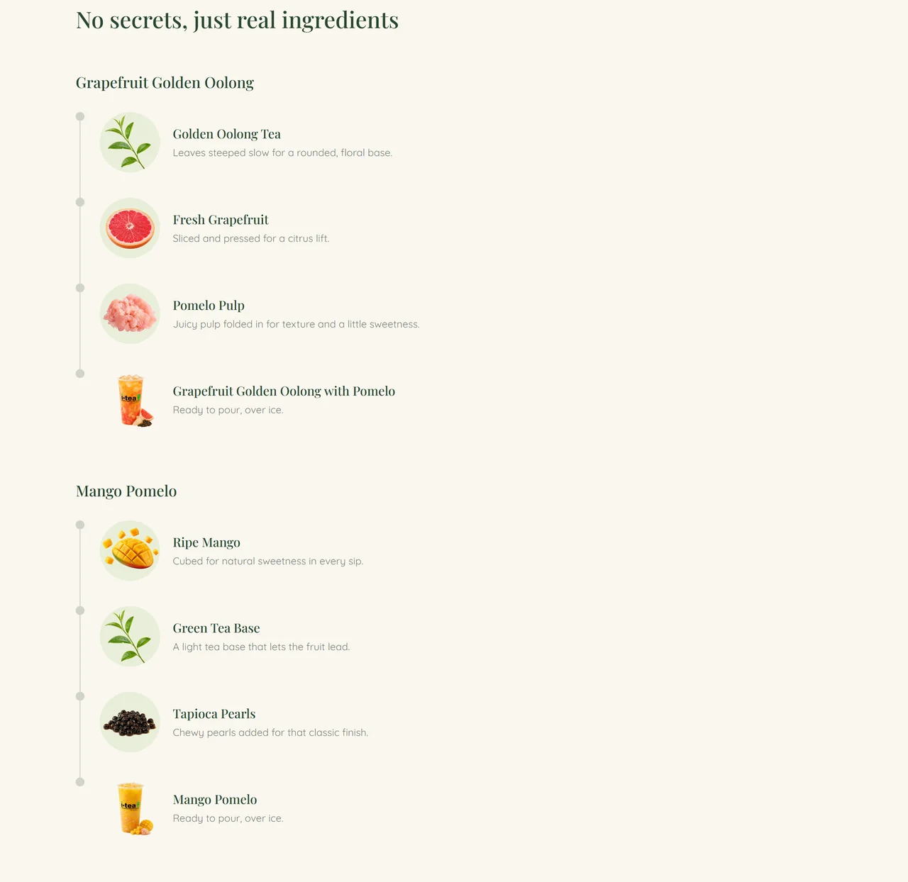
Told the rest through alternating editorial product spotlights and ingredient breakdowns, and kept an honest app-ordering and store-finder concept that states plainly what is not live yet.
Key features
What makes it work
- Layered multi-product hero with responsive composition
- Campaign carousel for rotating seasonal stories
- Mood-led drink-discovery cards
- Filterable signature-drinks catalogue
- Alternating editorial product spotlights
- Ingredient-led drink breakdowns
- Mobile-ordering concept and store-finder presentation
- Accessible carousel controls with reduced-motion handling
Gallery
A closer look
Build
Under the hood
- Layered multi-product hero that stays composed from 1440 down to 390
- Reusable campaign-slide structure with accessible arrow, dot, keyboard and swipe controls
- Signature catalogue rendered from a single data array with working category filters
- Alternating editorial product-story and ingredient-timeline layouts
- prefers-reduced-motion honoured across hero, reveals, carousel autoplay and smooth scroll
- Clean console with every image and asset returning 200 in local testing
Reflection
Looking back
The redesign shows how a large drinks catalogue can keep its personality without sacrificing clarity. Reusable campaign, product and ingredient systems let the brand feel expressive while keeping the experience manageable across desktop and mobile.